Behdad Esfahbod's daily notes on GNOME, Pango, Fedora, Persian Computing, Bob Dylan, and Dan Bern!

My Photo
Name:
Location: Toronto, Ontario, Canada

Ask Google.

Contact info
Google
Hacker Emblem Become a Friend of GNOME I Power Blogger
follow me on Twitter
Archives
July 2003
August 2003
October 2003
November 2003
December 2003
March 2004
April 2004
May 2004
July 2004
August 2004
September 2004
November 2004
March 2005
April 2005
May 2005
June 2005
July 2005
August 2005
September 2005
October 2005
November 2005
December 2005
January 2006
February 2006
March 2006
April 2006
May 2006
June 2006
July 2006
August 2006
September 2006
October 2006
November 2006
December 2006
January 2007
February 2007
March 2007
April 2007
May 2007
June 2007
July 2007
August 2007
September 2007
October 2007
November 2007
December 2007
January 2008
February 2008
March 2008
April 2008
May 2008
June 2008
July 2008
August 2008
October 2008
November 2008
December 2008
January 2009
March 2009
April 2009
May 2009
June 2009
July 2009
August 2009
November 2009
December 2009
March 2010
April 2010
May 2010
June 2010
July 2010
October 2010
November 2010
April 2011
May 2011
August 2011
September 2011
October 2011
November 2011
November 2012
June 2013
January 2014
May 2015
Current Posts
McEs, A Hacker Life
Wednesday, August 17, 2005
 Arabic Joining Rendering Problem

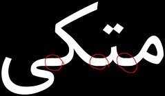
I'm been thinking about this weird problem that FarsiWeb fonts look bad at small sizes. The effect was like some glyphs being placed one pixel above where they should be and so an unwanted shift when they join to the neighboring glyphs. I discovered what's going on when accidentally rendered a sample text in huge font with inverse colors. A reworked sample is the image exhibited in this post. See it at full size here. If you don't see the problem, try enlarging the photo.

The problem is two-fold, and by far one of the hardest problems I have faced so far in Persian computing. In short: A) The glyphs in the font have tails spanning out of the glyph extents. B) When rendered with anti-aliasing on, the overlapped section becomes darker, due to being rendered twice.

I need to elaborate on why glyphs have those long tails in the first place. Since anti-aliased rendering is a relatively new phenomenon and many older renderers have had rounding bugs, etc, Arabic font designer have mostly opted for have glyphs that overlap, to make sure no white gap shows up at the joint. I have witnessed such a problem myself with DVI/PS/PDF viewers quite a few times while working on FarsiTeX. The solution again, have been to mechanically add some extra tail to make sure no gap is rendered. But now with anti-aliased rendering, it's causing problem.

The overlapping glyphs is what Keith Packard calls a broken font. Seems like Xft already takes extra care of joining glyphs, pre-adding the joints such that they don't look weird. So all we need is fonts that are not broken, which is, well, reasonable. Seeking for another fix may fail miserably, since otherwise you need to either 1) use conjoint operators to add the glyphs to a temporary surface and compose it to destination afterward, but keithp says even that doesn't quite work, or 2) merge all the glyph paths and draw them in one operation. This one sucks performance-wise, sine each glyph will be drawn from path every time, instead of the usual fast path of getting FreeType render glyph alpha masks that are cached on the server by Xft...

But there's one more reason to have broken fonts: We use that in our justification algorithm in Persian TeX systems. To implement proper Arabic justification in TeX, there are two ways: 1) use rules (black boxes), this is the easiest, but suffers from the same broken-viewers problem: the rules will be rendered with solid black edges, while neighboring edge from the glyphs is antialiased. 2) use cleaders to repeat a narrow joining glyph. This eats a lot of resources in the final output and rendered, but at least looks better. But since cleaders insert an integer number of those glyphs, we need to somehow fill the remainder, and we do that by having glyphs with joining tails extended out of their box. Is there another way to do justification without broken fonts? Maybe. With a PostScript backend for example, one may be able to write PS hacks to convert an stretchable rule or glue into an scaled joining glyph. Or we may be able to add support for that to pdfTeX. They have recently added a bunch of types, like floating point registers, etc. They are quite open to useful extensions. It may even be solved by PangoTeX, by the time it happens, Pango would definitely have support for Arabic justification :-).

There is a partial third solution: Use hinting to make sure the baseline of the font occupies a full number of aligned pixels, such that double-painting doesn't make any difference. But that seems to be harder to achieve than just cutting the tails.

Comments:
I've suffered from this effect too much, so I switched to Omega, and that was really better.
 
Post a Comment


<< Archive
<< Home